working in Photoshop today
Friday, February 28, 2014
Blog review 2/28
State of Our Art, According to Whitney
A Guide to the 2014 Whitney Museum Biennial
by: Carol Vogel
http://www.nytimes.com/2014/02/28/arts/design/a-guide-to-the-2014-whitney-museum-biennial.html?ref=design&_r=0
The layout of this blog is that of an informative blog as it tells us about the Whitney Museum and the layout of the museum.
The reason i chose this article was because of the picture above as the color just stood out to me and caught my eye. The article was about an museum and how you should go through it. it was not that really interesting as the picture made it as it was more informative then anything.
Self-Portrait and Portraits of Others
Chilling on a bench by:Sean Pierce
Midday Nap by:Sean Pierce
This is a portrait of my cousin and her friend taking a midday nap on the living room couch
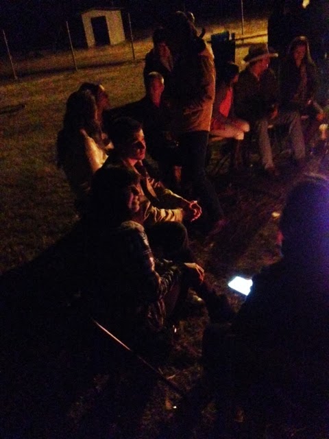
Night by the Fire by: Sean Pierce
This is a portrait of people just hanging around a bon fire late at night.
Lanes of Friends by: Sean Pierce
This is a portrait of my best friend Stazia as we went bowling.
Shaved in the country: by Sean Pierce
This is a portrait of me at the barn when I just got my new hair cut
Friday, February 14, 2014
Blog review 2
The 2014 Kiss Exhibition: Happy Valentines Day
By Aline Smithson
By Patricia Sandler
The Layout of this blog just states a short statement about what the article is about then just photos.
The Title of the article was Compelling because it is Valentines day today. The article is about love shared between many different things. I was truly interested by the first pictures with shopping carts as it made it about consumerism more then love.
portraits continued
By Antonin Kratochvil
I chose this portrait because of the eerie feeling that the picture gives you with the blurred background and the focus on the girl in the middle of the picture
By Francesco Scavullo
I chose this Portrait because of the way he was able to use the colors and lighting to bring out the features of the woman
Portraits
By: Steve Mcurry
I Chose this Portrait by Steve Mcurry because of its ability to use contrasting colors to make the subjects eye's to really stand out, I also chose it as I new of this portrait before this class as my dad showed it to me before.
By Eve Arnold
Subscribe to:
Posts (Atom)